Julienne
PROJECT Julienne ABOUT Julienne is a café that bridges tradition and modernity, grounded in vegetarian and organic values. The brand identity captures this harmony: approachable yet refined, minimal yet vibrant, celebrating the beauty of honest simplicity. I designed the logo beginning with hand-drawn sketches to explore a custom, expressive typography. SERVICE Graphic DesignLogo DesignBrand IdentityIllustration […]
Maré
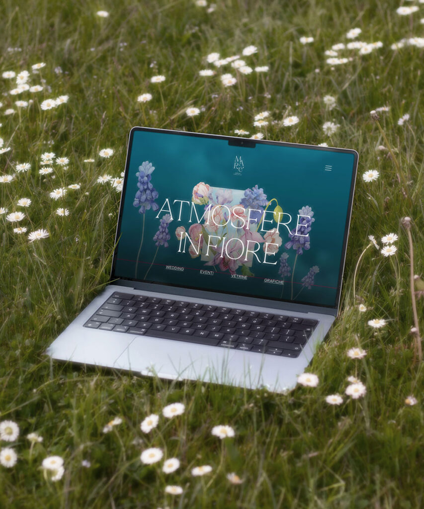
Maré Floral Stylist VISUAL IDENTITYLOGO DESIGNGRAPHIC DESIGN Maré is a floral stylist whose brand is led by an all-women team. I teamed up with art director Elisabetta Ozino Caligaris and we created the full visual identity, designed to capture both elegance and feminine strength through typography and color. The visual language plays with bold color […]
Trattoria Giapponese Lemon
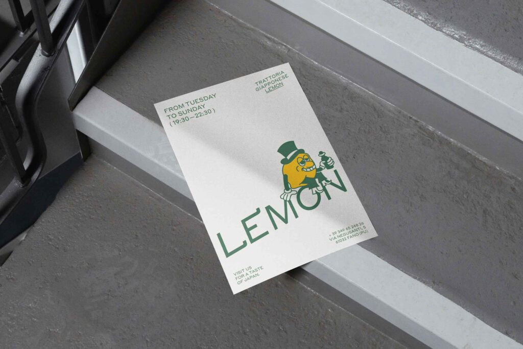
Trattoria Giapponese Lemon BRAND IDENTITYILLUSTRATION Lemon is a small and charming restaurant, a warm place where true homemade tradition is authentic, simple, and full of soul. They asked me to create a complete visual identity, from the logo to the design of their menus, to convey their essence: genuin yet full of fun and irresistible […]
Opera
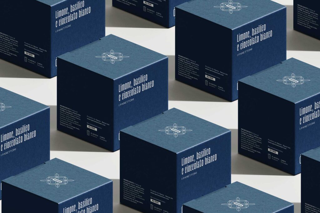
Opera – Sweet Art BRAND IDENTITYLOGO DESIGNPACKAGING Opera is a high-end pastry brand, transforming each product into a meticulously crafted work of art. In collaboration with Grafene Studio, we began with the creation of the logo and then developed an elegant color palette to distinguish each product, giving every item a distinct and precise identity. […]
Grafene Studio
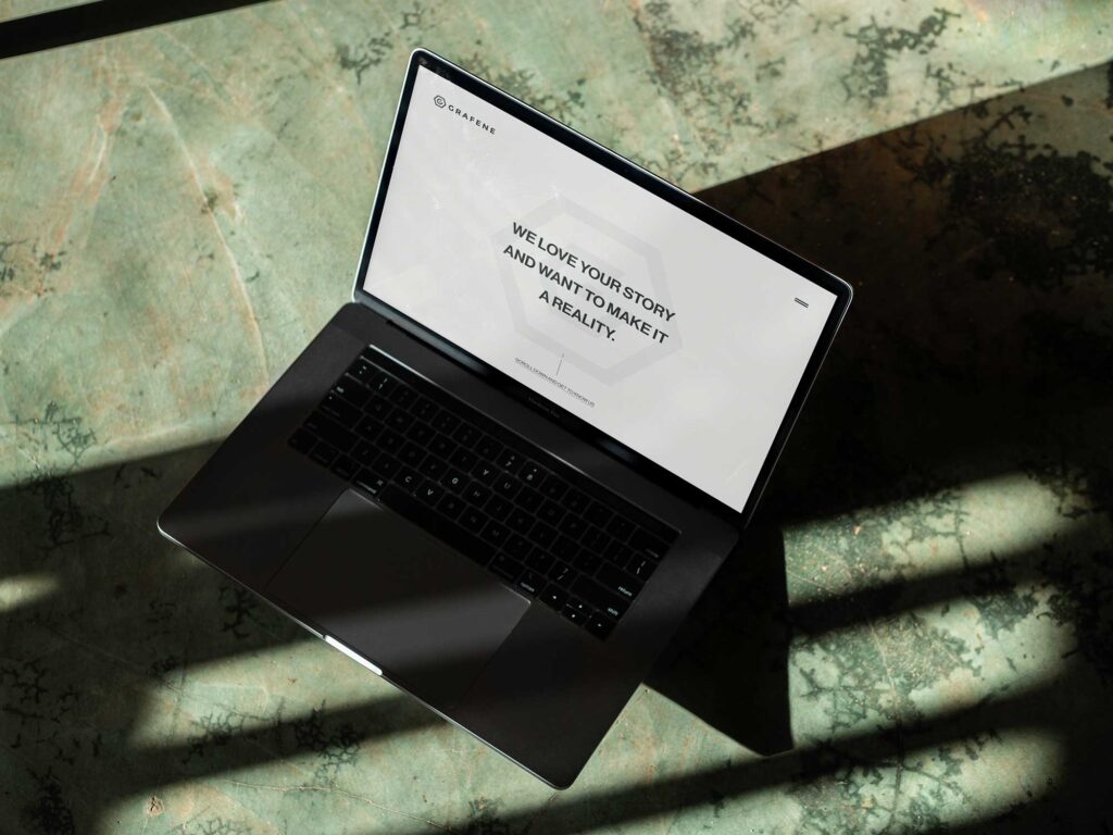
Grafene Studio WEBSITE DESIGN Grafene Studio wanted to redesign their website for a modern yet timeless look. The result is a website that blends contemporary aesthetics with bold typography and vibrant accents. Its intuitive, responsive design ensures seamless navigation, presenting projects and services with clarity while reflecting the studio’s creative and professional ethos. ← Previous […]
Viale Verde
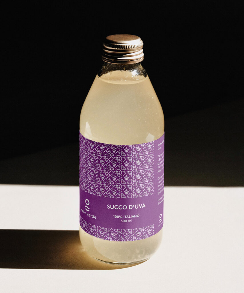
Viale Verde GRAPHIC DESIGN Label design for Viale Verde’s grape juice and jam, featuring geometric patterns in golden yellow and deep purple. The design reflects the brand’s artisanal quality, natural freshness, and sophisticated character. ← Previous Next →
Ri-Edito Italiano
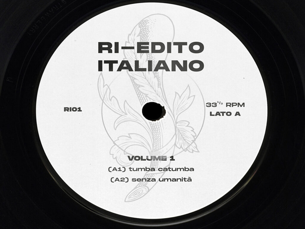
Ri-Edito Italiano GRAPHIC DESIGN Ri-Edito Italiano celebrates Naples with a vibrant blend of timeless melodies and modern nu-disco beats, bridging nostalgia and freshness. The “Asso di Bastoni,” or Ace of Wands in Italian playing cards, symbolizes strength, vitality, creativity, and fresh beginnings, embodying new opportunities and spiritual growth. ← Previous Next →
World In My Eyes
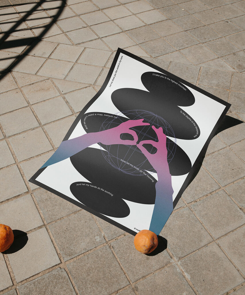
World In My Eyes POSTER DESIGN The poster design is inspired by Depeche Mode’s song “World In My Eyes”, which immerses the audience in a world of sensory overload and emotional depth. With themes of desire, escapism, and the longing for connection, the song captures a transcendental experience where boundaries dissolve and reality fades, inviting […]
Sinner
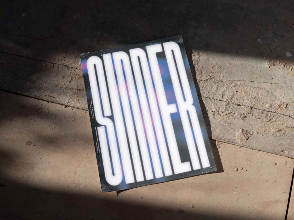
The Sinner POSTER DESIGN The typographic poster is inspired by Depeche Mode’s “The Sinner In Me”, a haunting exploration of inner conflict and temptation. With its dark, atmospheric soundscapes and evocative vocals, the song delves into the tension between morality and desire, offering a raw, introspective journey into the complexities of human nature. ← Previous […]
Eccellenze A Palazzo
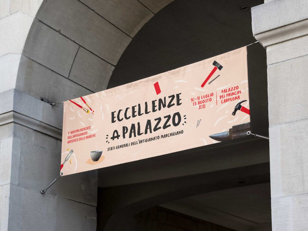
Eccellenze A Palazzo EVENT DESIGNGRAPHIC DESIGNPRINT DESIGN During my time at Comunica Agency, I developed the visual identity for the Eccellenze A Palazzo event. The initiative celebrates the rich artistry and craftsmanship of the Marche region, bringing together twenty artisans in a curated trade experience. Each participant presents their work through exhibitions, workshops, and live […]